At its heart, visualisation is the study of visual representations of abstract data undertaken in order to reinforce human cognition - which is really just a fancy way of saying pictures and graphical displays are used to more accurately and easily interpret numerical and non-numerical data.
With the arrival of big data and all it entails, accurate and easily understood visualisations and graphics have cemented their importance. However - as is the way of most things nowadays - in order to get to the good, users need to wade through the bad. But, more importantly, users need to recognise the bad and embrace the good.
Good visualisation should be all about presenting and communicating data in a way that helps users make robust decisions based on accurate data. It also means providing effective representation of the underlying data in order to help answer particular questions, as well as to highlight 'not yet thought of' questions. It is about making large data sets coherent and encouraging the comparison of differing pieces of data. It is about smart, useful and informative design. In essence, good visualisation is the telling of a data 'story' using well-designed graphics.
Eye of the beholder
On the other hand, bad visualisation is distorting the 'story' of the data for the sake of 'beauty', busy graphics, incomprehensible information dressed up as lamb, unprofessional graphics and inaccurate labels, to list just a few of the inherent issues. Sometimes, bad visualisations are at best silly, at worst just plain stupid, and end up doing more harm than good.
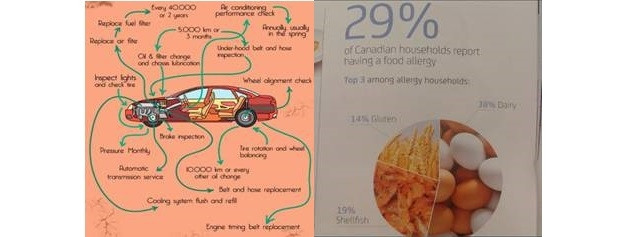
Below are two perfect examples of bad visualisation in action. The car graphic takes busy and incomprehensible to whole new levels, and the food allergy graphic, while being a nice idea, loses its message as soon as readers realise that in Canada eggs are considered to be dairy.
My top three guidelines for effective visualisations include:
1. Understand the story you are trying to tell
All too often, the task of creating a dashboard, graph or report is given to someone who is not completely familiar with the data or the business rules. A batch of out-of-context data is given to some poor souls with, hopefully, a bit of visualisation experience, and they are expected to perform miracles.
While entirely possible and doable - does it not make more sense for the data to be inherently understood and the requirements fully grasped before any attempt at a 'storyline' is attempted? Tools like Qlikview and Tableau have built-in 'point and click, drop and drag' functionality that makes it incredibly easy to create truly beautiful visualisations.
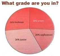
Unfortunately, beautiful does not equal correct or informative. Just because there is a percentage, it does not make the data understood, the display right or the percentage correct. As below, a very basic graphic can completely lose its message when the values depicted don't make sense.
2. Busy is bad
Frequently, the users of reports, graphs and dashboards have no experience or insight into the structures, peculiarities or formats of the underlying data. Business needs a clear, concise and clean view of the data in order to make effective business decisions.
Cluttered, busy, overly colourful visualisations - while pretty and striking - quite often detract from the importance of the data or from the message of the data. The fight is lost before it has even started. In the time it takes a user to trawl through the graphic below, the momentum and importance of the story is gone.
3. Simplify, simplify, simplify
Using a light rod to detect WiFi vertically combined with long-exposure photography and invisible networks all around looks tangible.

As above, unless a user is trying to create art with visualisation, the best graphical representation of any data is conveyed when things aren't too complicated. Easy-to-use information-bearing graphs, reports and dashboards are the most effective at translating the 'story' of the data into decisions. Always keep in mind that, just like life, the data life cycle is too short to be complicated.
Luckily, as with many specialisations, visualisation has its own champions. Among others, Stephen Few has emerged as one of the leading voices in support of simplified visualisations.
Unfortunately, beautiful does not equal correct or informative.
"With a dashboard, every unnecessary piece of information results in time wasted trying to filter out what's important, which is intolerable when time is of the essence," he said in his book, "Information Dashboard Design".
In short, Few's message is much like mine. Don't get lost in the noise, in the colour, in the animation. Top visualisation practitioners understand that translating data into a graphical representation is not about being pretty. It is not about moving bits and pieces. It is all about getting the message across as simply and as easily as possible, while retaining the integrity of the data, and having an inherent trust in the message.
Graphic references:
[*] http://wtfviz.net/
[*] http://wtfviz.net/
[*] http://wtfviz.net/
[***] http://flowingdata.com/2011/12/21/the-best-data-visualization-projects-of-2011/
Share