There exists an overwhelming volume of information that today's worker should remain acquainted with, not only for the purposes of directly discharging their duties, but simply to remain current and competitive within their markets, industries and the world at large.
Consider the doctor who endeavours to remain up to date with new medical developments; or the IT professional who needs to keep up with ever-changing technology. What method might prove more expedient? Assimilating the message of an infographic or reading an encyclopaedic journal? The answer is simple, and found in that age-old adage: a picture is worth a thousand words, says Frank Reinelt, senior director for Northern Europe & Emerging Markets at Mindjet.
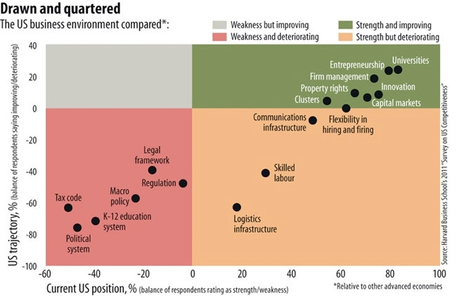
This can no better be illustrated than with the example of a recent article in The Economist's World in a 2013 magazine on an eight-point plan to restore American competitiveness, written by two eminent leaders of Harvard Business School's United States Competitiveness Project, Michael Porter and Jan Rivkin. The article was over 1 500 words - a fairly lengthy piece to read, cogitate and digest - but it was also accompanied by an excellent infographic that provided all of the information covered in the article at a glance.
This leads us to question how the principles of data visualisation could be applied to our daily work, and could they reveal any scope for improvement?
Now, as with most challenges, it is useful to first define an encompassing "problem statement", but this is difficult when considering the extreme breadth and range of an employee's work within their role. In this case, merely admitting the existence of a problem is not helpful, unless the extent of the problem can be quantified. Enter the role of data visualisation as it pertains to you.
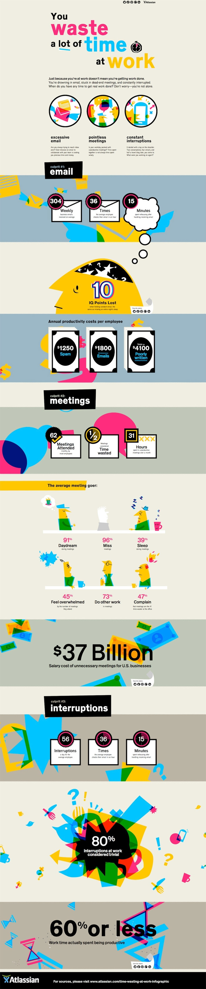
The fact is we all waste a lot of time at work. How much time? According to Atlassian, most of the blame can be attributed to three common culprits - e-mail, meetings and interruptions.
The average employee receives an average of 304 business e-mails per week, checks their e-mail 36 times per hour; taking 16 minutes to refocus after handling incoming e-mail; and 10 IQ points are lost when fielding constant e-mail, which is the same as missing an entire night's sleep. The annual productivity costs per employee are $1 250 for handling spam, $1 800 for dealing with unnecessary e-mails, and $2 100 - $4 100 in deciphering poorly written communication.
Employees attend an average of 63 meetings every month; half of which are considered a waste of time, meaning that 31 hours a month are spent in unproductive meetings. Of the average meeting-goer, 91% daydreamed during the meetings, 96% missed the meetings altogether, 39% slept during them, 45% felt overwhelmed by the sheer number of meetings they were required to attend, 73% did other work during the meetings, and 47% complained that meetings were the number one time-waster at the office. The salary cost of all these unnecessary meetings for US businesses is $37 billion.
The average employee experiences 56 interruptions per days, 80% of which are considered trivial; spends three minutes working before switching tasks and an average of two hours per day recovering from distractions.
Now, consider this same data visualised as an infographic.
Immediately we are faced with data presented in an easily identifiable way; visually appealing and laid out in such a manner to allow us to distil the most relevant and important areas. More importantly, visualisations such as these prompt creative interpretation of the results that are weighted more highly in our own estimation. The net effect of this increase in relevance is a corresponding increase in the likelihood of effecting behavioural change. That is to say, visualised information is more likely to lead to action.
If we accept that visualised data is more effective than the often verbose alternative, and that employees stand to benefit from changes in their current working behaviour and data consumption, then it becomes obvious that there is a need for software that can interpret work-related interactions and tasks, and that can relay analysis back to those involved, prompting powerful action that is a result of "I never thought of it that way before" introspection. Action prompted by this mechanism tends to be personal and long-lasting, leading to the development of effective habits.
Share
Mindjet
Mindjet helps people generate better ideas and work smarter through software that aids brainstorming, the organisation of plans and the management of projects - anytime, anywhere. Mindjet's interactive environment uses a visual framework to keep teams on point, on task, on time. Not surprisingly, 83 of the global Fortune 100 companies use Mindjet to get work done. Find out why. Mindjet. Work Inspired.
Mindjet and Work Inspired are trademarks of Mindjet, which may be registered in the US and other countries.
Editorial contacts