My colleague, Jessie Rudd, in last month's ITWeb BI Portal Industry Insight: 'Telling the story of data', championed the skill of data visualisation as a means of obtaining business value from data. Bearing in mind that effective data visualisation can be argued to be one of the primary skill sets of the new breed of 'data scientists', how would one go about acquiring and utilising these skills, either to become a data scientist, or simply to become more effective at their current role?
The target audience for upskilling in data visualisation is not limited to the business intelligence (BI) community. Jobs could range from asset management to marketing insights and even to statisticians - basically any role which involves turning data into a meaningful story.
Even PR specialists and spin doctors get in on the act! Take, for example, a recent Sanral statement, which stated that almost one million e-tags have been sold. This did not distinguish visually (a more effective method) whether or not they were all in use, or if the current percentage of active road users on the highways actually contained an e-tag.
Paint by numbers
Effective data visualisation is part science, part art. It takes an analytical approach to condense large datasets into content suitable for rich visualisation, and then it takes a creative approach to map to a model which conveys the story well, for the reader to understand.
In addition, the many dimensions available in modern, big datasets and businesses may sometimes just not fit into a simple bar graph (which effectively only presents two dimensions: X and Y). Stacked bar charts, line graphs, bubble plots, scatter, and heat maps are just some of the options available to a simple Excel report.
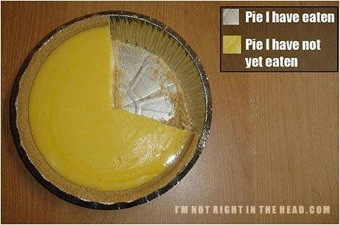
Of course, there's always the old favourite - the pie chart. Limited in scope, hard to visually compare slices and prone to the addition of a 3D element to make it 'prettier', it does not adding anything useful to the data story. There are even tools which allow users to spin the pie (why exactly anyone would want to do this, I've not quite worked out yet). The best example of a pie chart I've seen is the one below.
So, how do users sift through the various options available to determine the best method of visualisation? This can be a tricky process that requires a combination of training and expert experience.
Simple science
There's also debate within the data visualisation community about the extent to which the efforts to 'pretty' up a visual can counteract the 'clarity' required to convey the story. Both have to be balanced in order to achieve the end goal of getting the message across. If the message is unclear, it hasn't worked; if it's not engaging, then some of the audience is lost.
Let's take a look at a classic example, which probably leans a little to the entertainment side. The best proponent of this has to be Professor Hans Rosling, in his many enlightening and entertaining TED talks.
As can be seen from this video, complex datasets with many dimensions are best suited to bubble plots. Bubble plots can convey many dimensions with an X-axis, Y-axis, bubble identifier, bubble size, bubble colour and even moving bubbles over time.
Unless users are planning on presenting at TED any time soon, they would probably be better served simply becoming much more effective at their day-to-day presentations than trying to reconstruct the impressive video above.
Effective data visualisation is part science, part art.
Most data visualisations professionals have to construct many visuals over time on many different topics. The approach of simply becoming better and clearer with the visuals being produced is best represented with the work of Stephen Few. Less is sometimes more. This is a great resource for learning and expanding a user's body of knowledge in this field and assisting with selecting the right visual for the right data.
In addition, many companies heavily invest in advanced visualisation software, which have numerous powerful features and options. But to maximise the ROI of this investment, users need to go on an 'advanced driving' course in visualisation to exploit these to the max.
Share