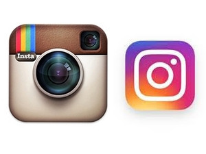
Five-year-old picture-sharing app, Instagram, has changed its look. However, users are not happy about the company abandoning the iconic 'cutesy' vintage camera logo and adopting a simpler, rainbow-inspired design.
The Facebook-owned firm says the redesign was inspired by how Instagram evolved over the last half decade, from a place to share filtered photos to a global creative community.
"Our updated look reflects how vibrant and diverse user storytelling has become," it said in a statement.
Instagram users, however, took to Twitter to express their distaste.
Jarrod Alonge said the new logo was unsettling. Twitter user Gracey said looking at it made her want to stab her eyes out.
Kattis bemoaned: "What have happened to Instagram new app icon? It is awful! Looks like a cheap student design." [sic]
Popular South African YouTuber Caspar Lee tweeted: "I love the new Instagram logo," to which thousands of fans promptly replied to ask if he was being sarcastic.
Ian Splater, head of design at Instagram, explained in a blog post how the team came up with the new logo. He said it first tried to modernise the old design by flattening it, but felt this lacked the visual weight of the original.
"We turned our focus to figuring out exactly what people loved about the classic icon and how we could carry that over. Anecdotally, we knew they loved the rainbow and the camera lens was a key visual element.
"With this insight, we decided to translate these elements into a more modern app icon that strikes a balance between recognition and versatility," said Splater.
On the inside
The inside of the picture-sharing app has also been redesigned. It features thinner menu bars and more white space.
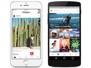
"We stripped the colour and noise from surfaces where people's content should take centre stage, and boosted colour on other surfaces like sign-up flows and home screens," said Splater.
The reaction for the inside of the app was much more favourable on Twitter.
Chase Guttman tweeted: "Who else is loving Instagram's redesign? I think the cleanliness of the white gives the images much more room to breathe."
Phoebe Shafinaz ?tweeted: "I love the new features and the improvements on the inside of the app. But I'm just incredibly fond of the old Instagram logo."
Instagram's other apps, Layout, Boomerang and Hyperlapse, also received updated logos in line with the redesign.
Instagram was acquired by Facebook in 2012 for $1 billion. This is the first time since launch in 2010 that the company has updated its logo.
In February, the company announced it had attracted over 200 000 advertisers since opening the app in September to anyone wanting to purchase an ad. Three-quarters of its advertisers are now outside of the US, the company said.
Instagram has rapidly grown its user base, surpassing 400 million users last year. By comparison, Twitter, which began selling advertisements more than five years ago, has 130 000 advertisers and 320 million users.
The Instagram platform grew locally from 1.1 million in 2014 to 2.68 million users in 2015, making it one of the fastest growing social networks in the country.
Share